

Introduction
Nowadays, the importance of mobile traffic should not be underestimated. Statistically speaking, it is more likely that you’re reading this article on a mobile device than on a desktop device. This fact has not only a huge impact on adapting the contents of a website to both mobile and desktop devices, but also for how to test a web application being rendered on mobile devices. This article will give you an overview of the distribution of the internet traffic between mobile and desktop devices and how to test web applications on mobile devices using Cypress.
The shift to mobile
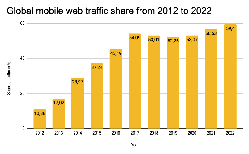
The percentage of the internet traffic coming from mobile devices has increased dramatically over the past few years. While it was only 11% percent in 2011, global web traffic on mobile devices nowadays amounts to nearly 60%! This is hardly surprising, since according to oberlo.com the average US adult spends five and a half hours per day using their mobile phones. This is also reflected in the expenses for mobile ads, which will exceed the desktop ads by the end of the year 2022. Another factor which contributes to this development is the consumption of social media. According to techjury.com, 25% of the time spent on the web goes to social media. And since social media is mostly consumed on mobile devices, this is probably also a factor for the massive increase of mobile web traffic.
Introducing our example app
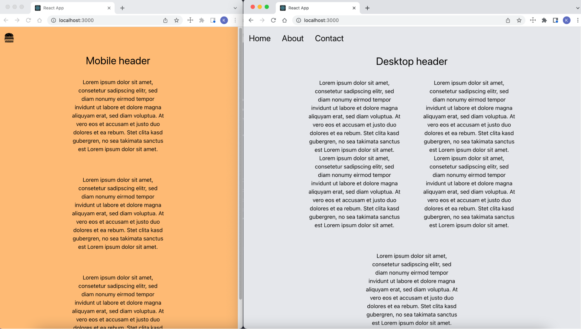
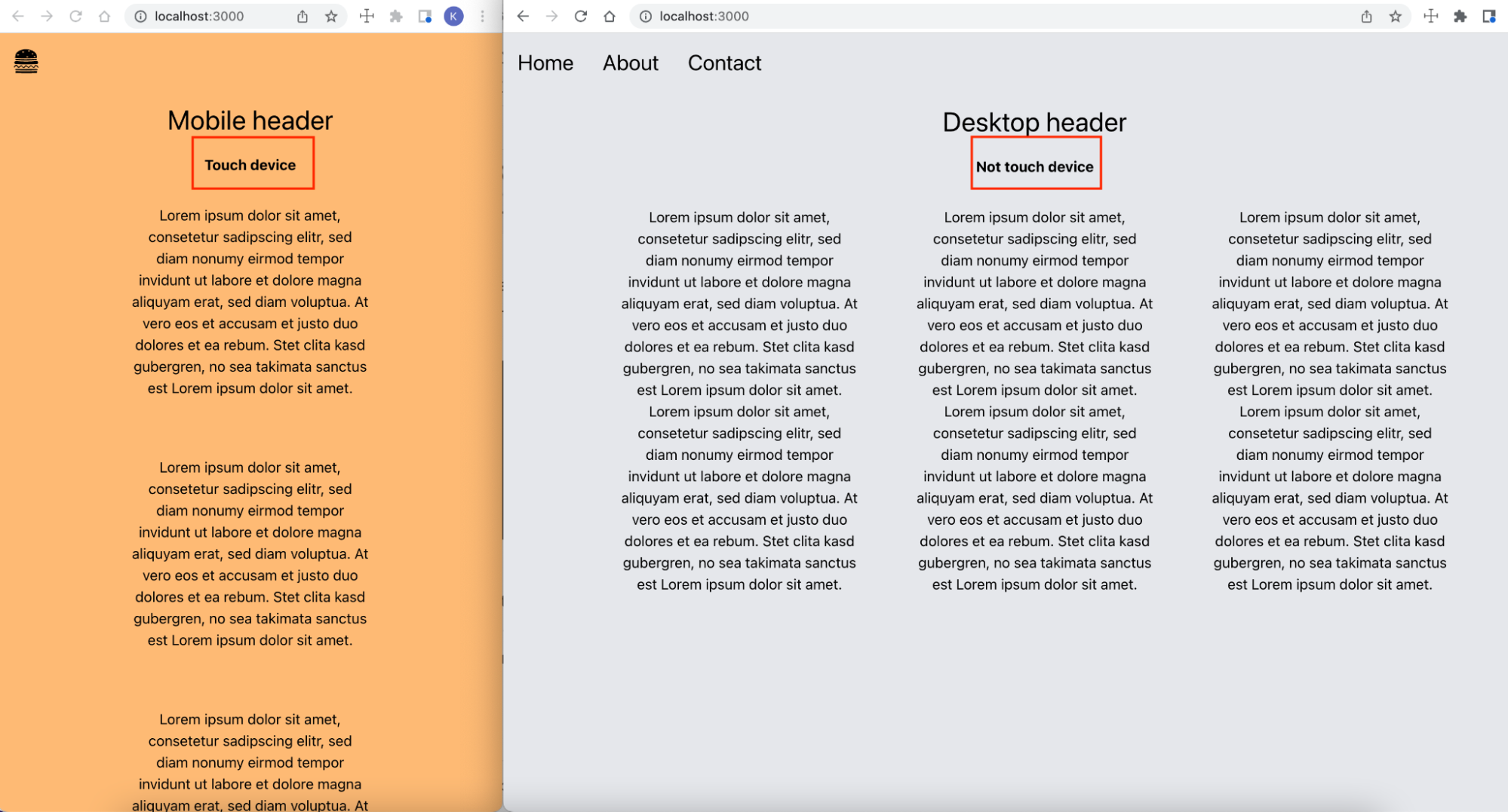
In order to demonstrate how to test mobile web apps in Cypress, I created a simple React App with TypeScript. Its design is fully responsive and the content itself depends on the screen size the web app is being rendered on. Below you can find screenshots for both the mobile and desktop version of the demo web app. You will notice that the background, navigation and header are different between those two versions of the demo web app. The source code of this whole project including the tests can be found here.
Below you can find the code of the App.tsx file, where either the <DesktopContent /> or <MobileContent /> is being
rendered. This decision depends on the screen width, which is calculated with the custom useWindowDimensions() hook.
Each time the size of the window object changes, this hook gets triggered. If the screen width is below 767 pixels, the
mobile version of the web page is rendered.
|
|
Testing mobile web apps in Cypress using cy.viewport()
By default, Cypress has limited support for testing mobile devices. However, there are a few tricks and workarounds we
can use to get Cypress to more closely emulate a mobile browser. The first approach we’ll cover is the cy.viewport()
command, which you can use to control the size and the orientation of the screen for our tests.
Let’s cover all of the available ways to work with the cy.viewport() command. The test file that includes all these
different options can be found at cypress/e2e/viewport.cy.js inside the
GitHub repo.
I created two custom Cypress commands for testing both the mobile and desktop version of the demo app in order to avoid repeating the same code in every test case:
|
|
By default, Cypress sets the screen width to 1000 pixels and the screen height to 600 pixels.
These default values can be overwritten in the cypress.config.ts file. Simply add these lines of code to your config
file and Cypress will automatically set the viewport to these values.
|
|
Alternatively, you can set the viewport right away when starting Cypress via the command line:
|
|
Another option is to call cy.viewport(width, height) inside of your tests:
|
|
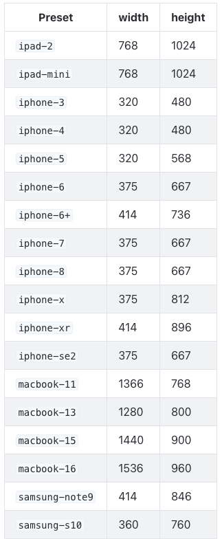
Instead of explicitly setting the screen size like in the code snippet above, you can also use certain presets to set the viewport:
|
|
The screenshot below lists all available presets with their corresponding screen sizes:
With the following example, you can dynamically test multiple viewports. We iterate over an array of presets/screen sizes:
|
|
With the cy.viewport() command it’s even possible to change the orientation of the device to landscape:
|
|
Emulating taps and swipes via the Chrome DevTools Protocol
Apart from using the cy.viewport() command to simulate a mobile device in Cypress, you can tell Cypress that the
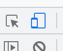
application is running on a touch device. When working with the Chrome DevTools, you can set the **“mobileEmulation”
**flag by clicking the Icon shown on the screenshot below. This will enable Chrome’s tapping and swiping emulation
support.
In Cypress, you can also programatically set this property using the Chrome Debugger Protocol (CDP). There is a npm package called cypress-cdp which exposes the CDP through a custom Cypress command. Run following command in your shell to install the package:
|
|
Inside the cypress/e2e/touchDevice.cy.js file you can find following test:
|
|
In the code snippet above we invoked the setTouchEmulationEnabled and setEmitTouchEventsForMouse CDP commands with
the help of the cypress-cdp package:
- setTouchEmulationEnabled -
Enables touch event emulation (e.g. emitting events like
touchstartandtouchendinstead ofmousedownandmouseup), and - setEmitTouchEventsForMouse - Enables touch emulation based on mouse input. This is required in order to correctly emulate things like swiping on some web apps.
I extended the React app by adding a <div> element containing text that states either “Touch device” or “Not
touch device”:
To determine, whether a touch device is simulated or not, the following code inside the App.tsx was used:
|
|
Setting the proper User Agent
Another way to determine on which device a web page is being rendered is the user agent. The user agent is a string inside the header of a request, which holds information about the user’s browser and operating system. Within Cypress, there are two ways to explicitly set the user agents for your tests.
The cypress.json file allows us to globally set a default value for the user agent for all tests like this:
|
|
However, the downside of this approach is that you set the user agent for all of your tests. A more convenient way is to
again make use of the onBeforeLoad event and set the user agent there:
|
|
Conclusion
This article covered several different strategies for more closely emulating mobile devices in your Cypress tests. This includes setting a proper viewport, using CDP commands to leverage Chrome’s native mobile emulating, and setting a user agent that make requests appear like they’re coming from a mobile browser.
Reflect: An alternative to Cypress with robust mobile support
Reflect is a no-code testing tool that can emulate a mobile device and test virtually any action you can take on a browser.
Creating a test in Reflect is easy: the tool records your actions as you use your site and automatically translates those actions into a repeatable test that you can run any time.
Get automated test coverage for your web app today — try it for free.