Introduction
In this post, we’ll aim to cover practical techniques developers can use to debug, manipulate, and otherwise probe running web applications via Chrome’s built-in devtools. The goal is to articulate the specific steps and shortcuts we would use at Reflect, and to favor breadth over depth. Readers can follow the guide step-by-step and try it out themselves at the provided link provided below. With that in mind, let’s imagine the following (contrived) scenario.
You are an engineer recently put in charge of leading your organization’s webapp development. You have relatively little experience with the codebase, and the last person who was in charge has since left. A support ticket comes in from a frustrated user complaining that a specific page in your app is slow. There is no additional context and there have been no deployments for a week. Rather than jumping right into your editor and trying to aimlessly solve the problem there, let’s instead use devtools to begin the investigation.
Demo & Walkthrough
Let’s assume you or your team has already looked at the health of the services / APIs that power the app and everything looks good. It appears that the issue reported by the user is isolated to the frontend itself.
The first thing we’d like to do is just load the page and see if anything jumps out at us. All we know is that the user complained that the app is “slow”.
Step 0: Open the link below in a new tab/window and confirm it loads
The page in question has very little going on. A single image and some scrollable text. Intuitively, a few things stand out. The first is that when the user says the app is “slow” they likely mean one of two things
- The text and image are slow to load. You’ve already counted this out by inspecting the network and confirming pages load quickly
- The text jitters while being scrolled and leads to a janky experience
You try scrolling the text and observe that it’s smooth. Now what.
We’ve taken some time to inspect the page visually and cannot repro the reported experience ourselves. Let’s open devtools and start poking around under the hood.
Step 1: Use cmd+alt+i (on mac) to open devtools. Ensure you are on the Elements panel.
Note: The rest of this article assumes your devtools are docked to the right side of the page and that they are wide enough to position subpanels side-by-side.
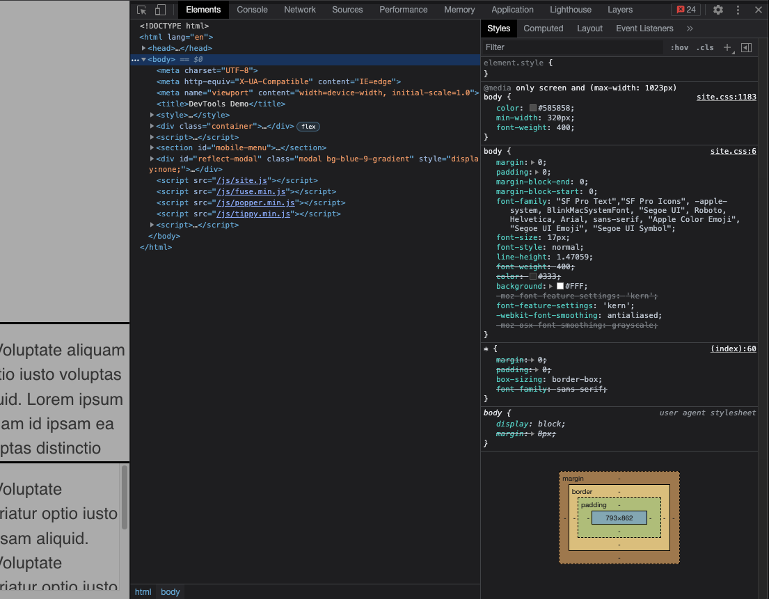
Let’s start by taking a closer look at the image on the page
Step 2: Open the console at bottom of devtools by pressing the esc key
We want to grab the image element and log it to the console. We could use document.querySelector('img') to find it
but in this case we can instead use the globally defined $ function. This function is built into devtools and will
work as a shorthand for document.querySelector as long as the underlying application does not overwrite it (e.g. if
the app loaded jquery then $ would be overwritten).
Step 3: Find the element with $('img')
The element is now logged in the console and we want to inspect it in the DOM itself
Step 4: Right click the element in the console and select “Reveal in Elements panel”
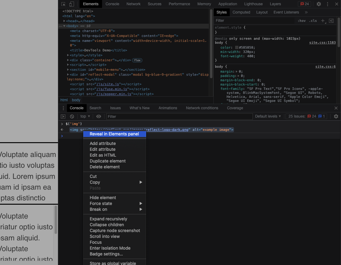
Notice the tiny inline == $0 next to the element in the Elements panel? This indicates that the element has been
assigned to the global $0 variable.
Step 4: Confirm this is the case by typing $0 then enter in the console. Observe that the element has been logged again
We’ll now start investigating this element and look for any red flags. Remember that we have nothing to go on beyond the single support ticket. Looking at the styles attached to this element, nothing in particular stands out.
Note: The styles seem a bit odd given what they actually achieve, but we’ll ignore this for the sake of the demo.
After inspecting the styles, let’s see if there is any javascript-based functionality attached to this element.
Step 5: In the top right of the Elements panel, select the “Event Listeners” tab. It may be hidden behind a >> button.
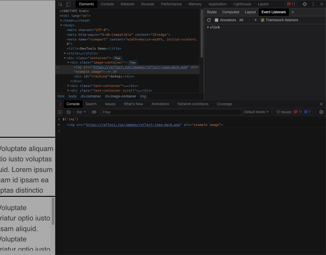
Alright! We’ve identified that there’s an event listener bound to this element that we weren’t aware of
before. In this case, it’s some functionality bound to the click event. Let’s try clicking on the image
and see what happens…
Nothing.
That’s odd, we expect something to happen when a user clicks based on the click event listener we found
in the Event Listeners tab. Let’s take a closer look at exactly what was supposed to happen.
Step 6: Expand the click event and observe the link to the listener’s source. Click it!
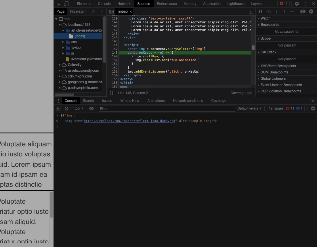
Devtools has now brought us to the Sources panel, and specifically to the line in our application that
defines the listener. Taking a closer look, we see that the behavior on click is conditional based on whether
or not the user was holding the shift key.
|
|
Now that we better understand the source we can try it out ourselves. We want to verify that the listener
is definitely executing when the user holds shift and clicks. A good approximation for this would be to
just try it out ourselves but we can be more certain if we use the debugger.
Step 7: Right click on the first line of the conditional in the listener and add a conditional breakpoint of e.shiftKey
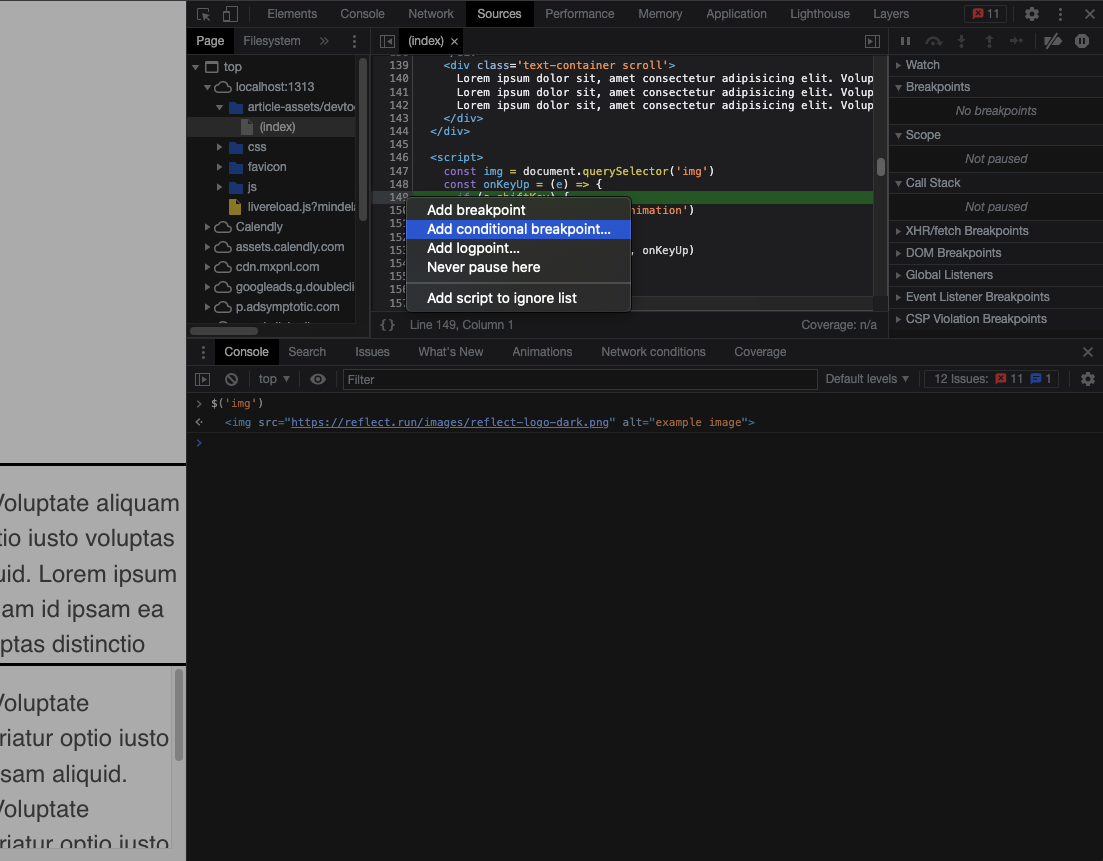
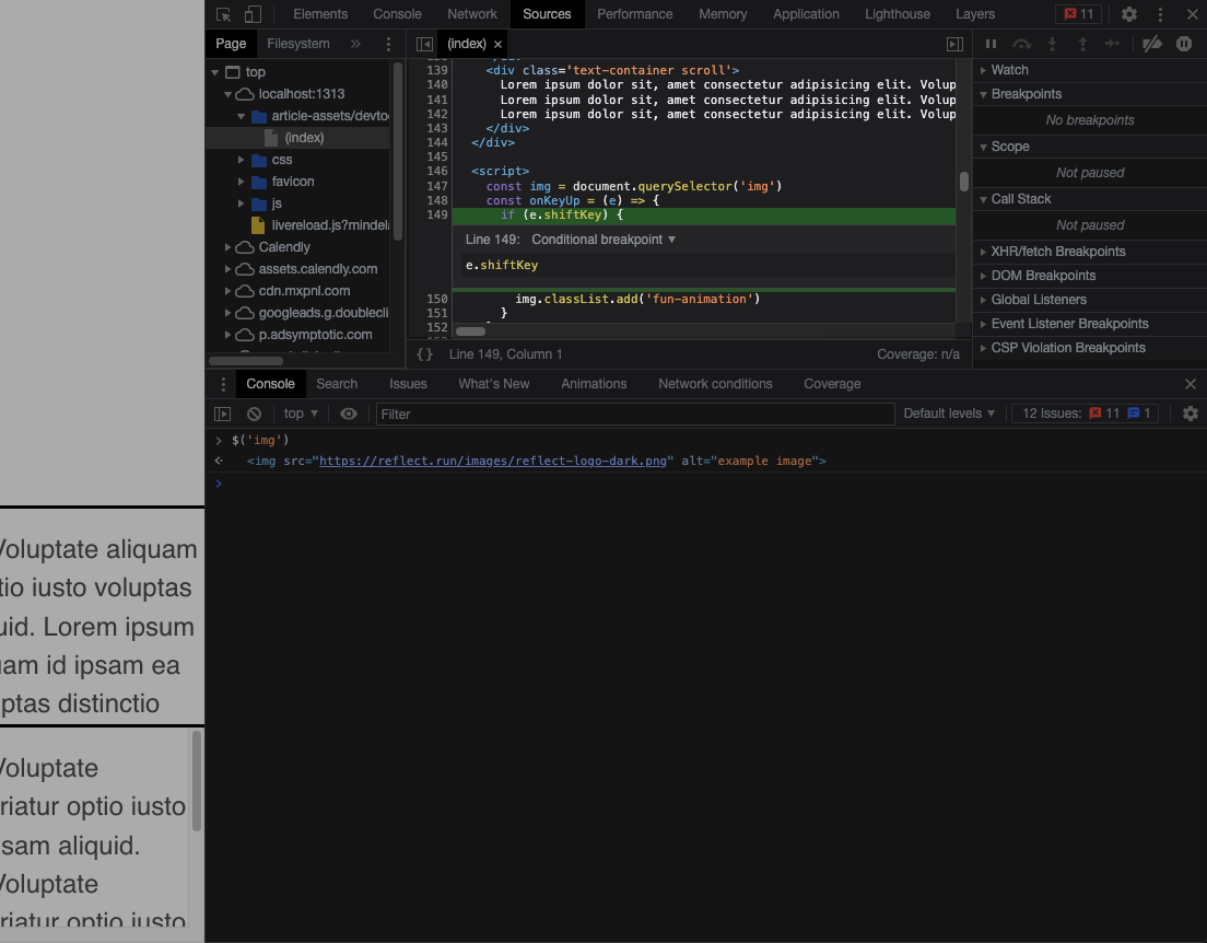
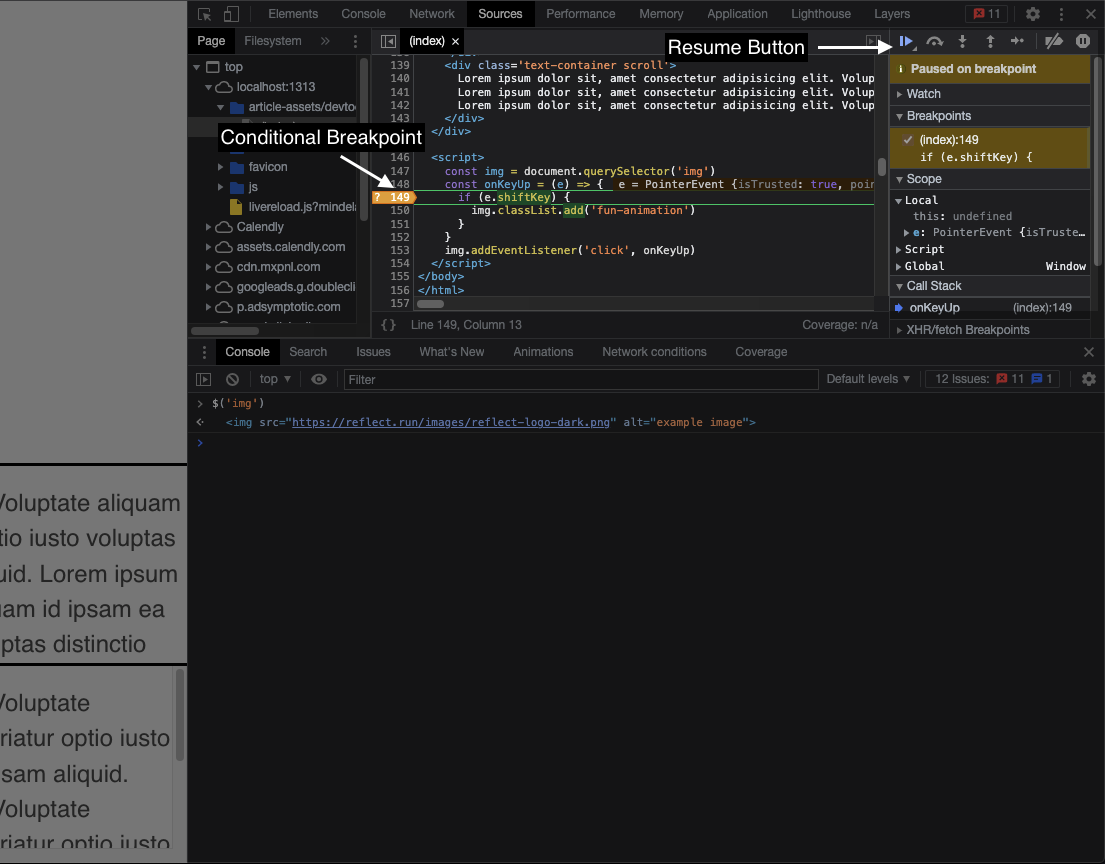
Now hold shift and click the image. You’ll observe that execution was paused at our breakpoint and we’re definitely
going to execute the listener. Remove the breakpoint by clicking on the orange line marker and click the “Resume execution” button in the top right.
🚨 Bad Performance Alert 🚨 Not only have we figured out a way to trigger the functionality attached to the element, but we’ve just seen our first big red flag. CSS animations are one of many very common performance pitfalls. We haven’t yet figured out exactly what the problem is, but this is a great direction to focus in on.
Note: You’ve now spoken to your manager and confirmed it is absolutely essential to the business that this image animates under these conditions, and it animates precisely the way it’s written. Sorry.
We can’t ourselves observe any obvious performance issues, but that may be because you’re working on a much more powerful machine than the user who reported the slowness. We can’t assume that the issue does not repro or is not caused by the animation just because we can’t experience it firsthand. We have tools that allow us to measure performance.
Step 8: Reload the page with cmd+r so we’re back in the original state. Open the performance panel in the top row of devtools and begin recording for about 2-3 seconds. Then trigger the animation with shift+click, wait another 2-3 seconds, then finish the recording. If the graph is too short to see, you can once again close the console by pressing esc
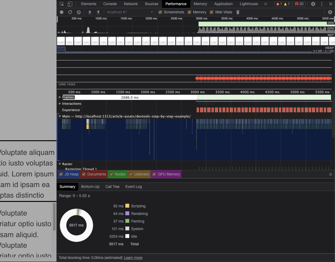
Jackpot. The performance panel is telling us that we have a serious problem with “layout shift”. We won’t cover this topic in depth in this article, just know that Layout is one of the steps in the rendering pipeline and is responsible for computing where every node on the page will ultimately be rendered, and at what size. Because all nodes in the DOM can affect the position/size of all other nodes, this process is complicated and we want to keep layout shift to a minimum.
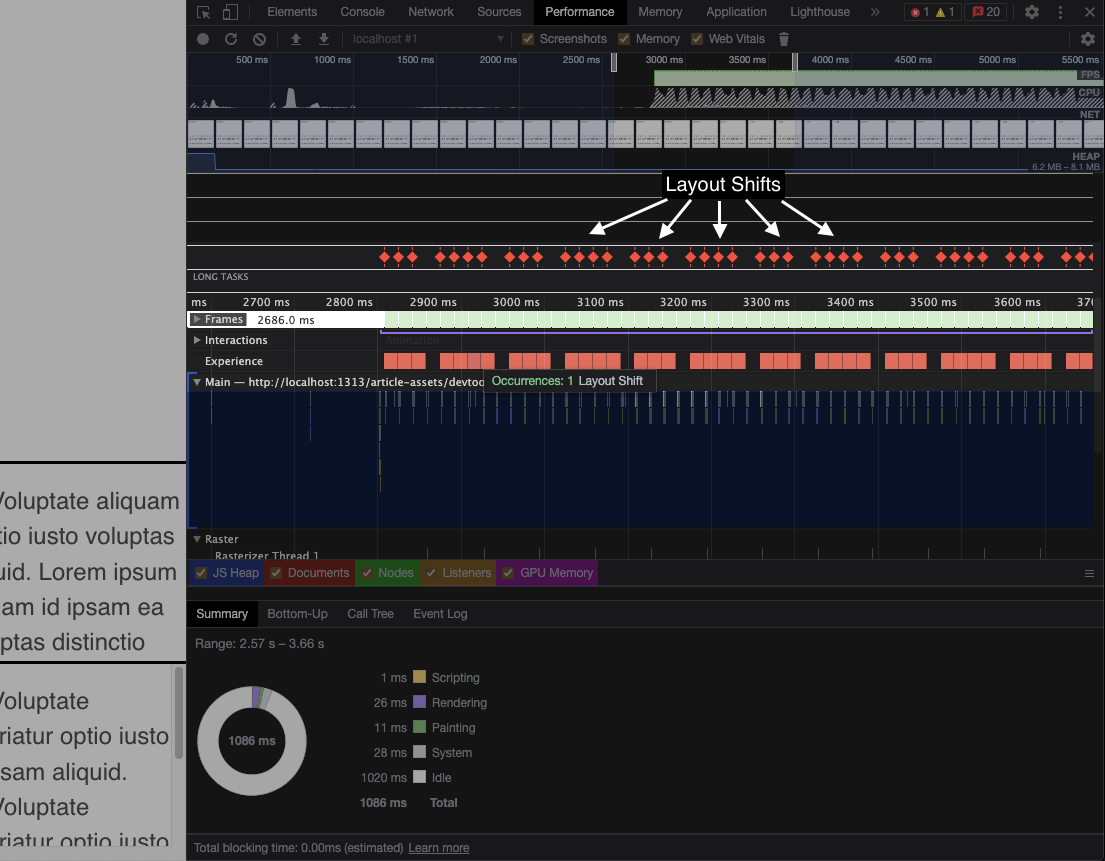
Our goal now is to identify why precisely these layout shift events are constantly firing and to figure out a way to minimize or remove them entirely while preserving the animation.
Let’s jump into the Layers panel to get a better sense of how the renderer “sees” the page.
Step 9: Press cmd+shift+p to bring up the Command Menu and start typing “layers”. Press enter when “Show Layers” is highlighted. I also suggest checking the “Paints” checkbox to see the pixels that are being rendered.
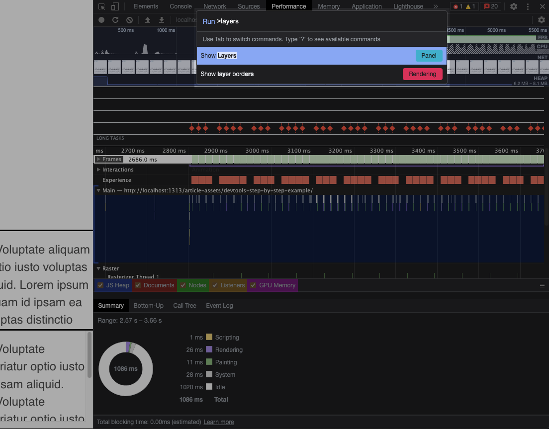
Note: The command menu acts as a shortcut to many of the most common actions you’d take in devtools. It is one of the best optimizations in devtools and can be used to change settings, switch panels, and more. Play with it!
We’re now on the Layers panel. If you’ve never seen this before, don’t worry, there’s not much we need to understand in order to use it in this example. The critical piece of information to know is that this is essentially a 3D model of the way our application is layered from the rendering pipeline’s perspective. When the browser rasterizes the parts of the page into pixels at the compositing stage, these 3D layers will be rendered onto the 2D plane of the viewport.
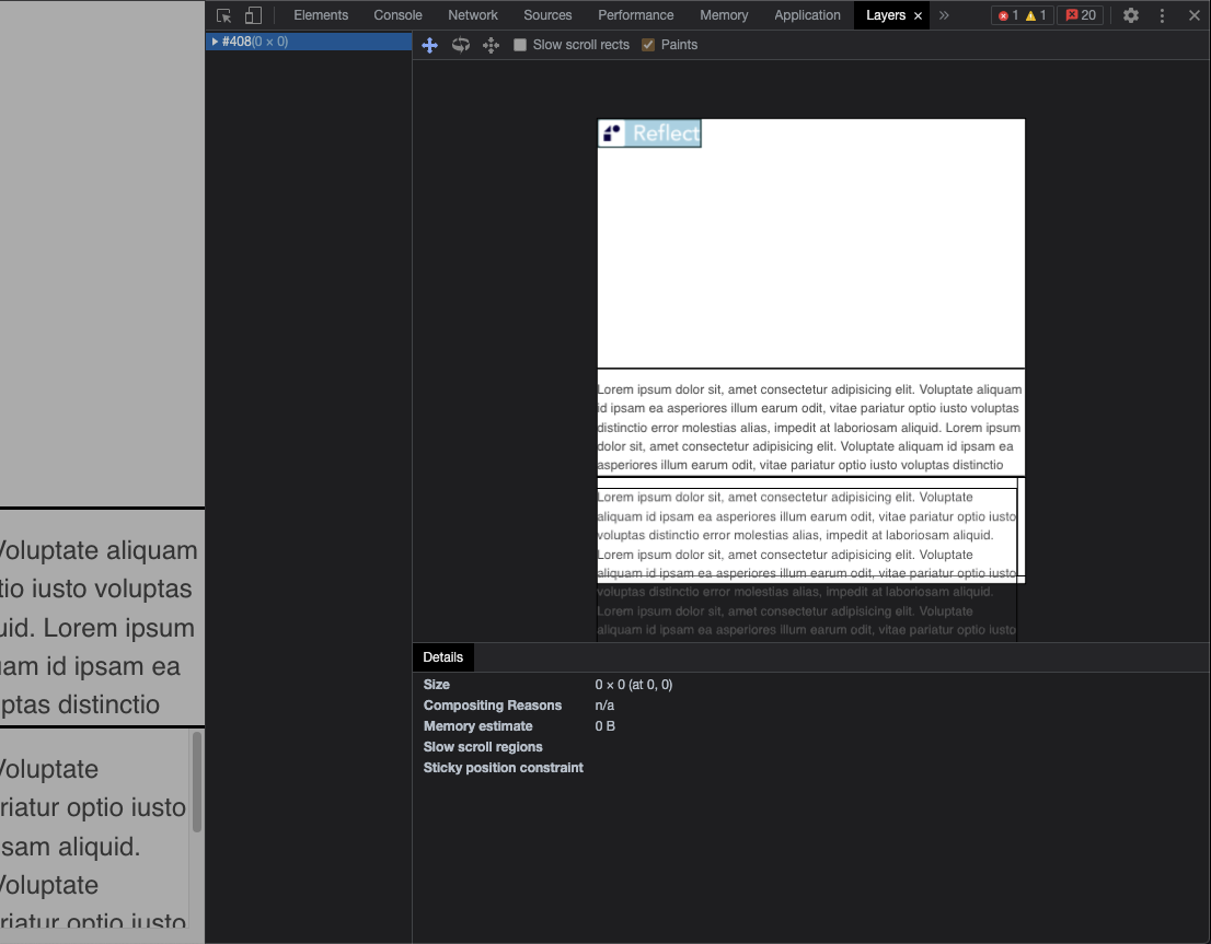
The Layers panel isn’t particularly interesting looking in its current state. All we see is a big rectangle that represents our
page. But this is actually a clue to where the layout shift is coming from! When the image is animating (changing dimensions) it is on
the same layer as everything else in the browser. This means that any changes to the image must result in the browser recalculating the
layout of the entire document constantly. You can observe that everything is on a single layer by pressing v to enter rotate mode, then
clicking and dragging the layers to rotate them in 3D space. You’ll see that the image is rendered on the “base” layer, along with the text
that does not scroll.
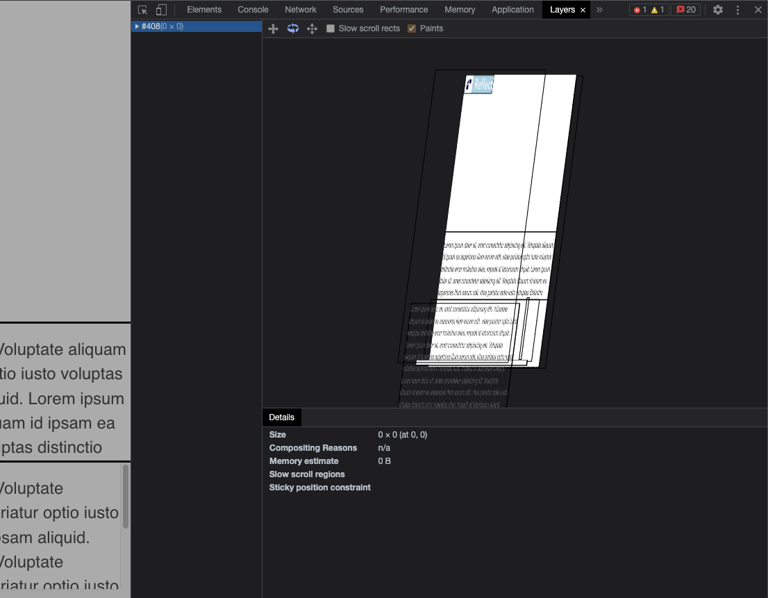
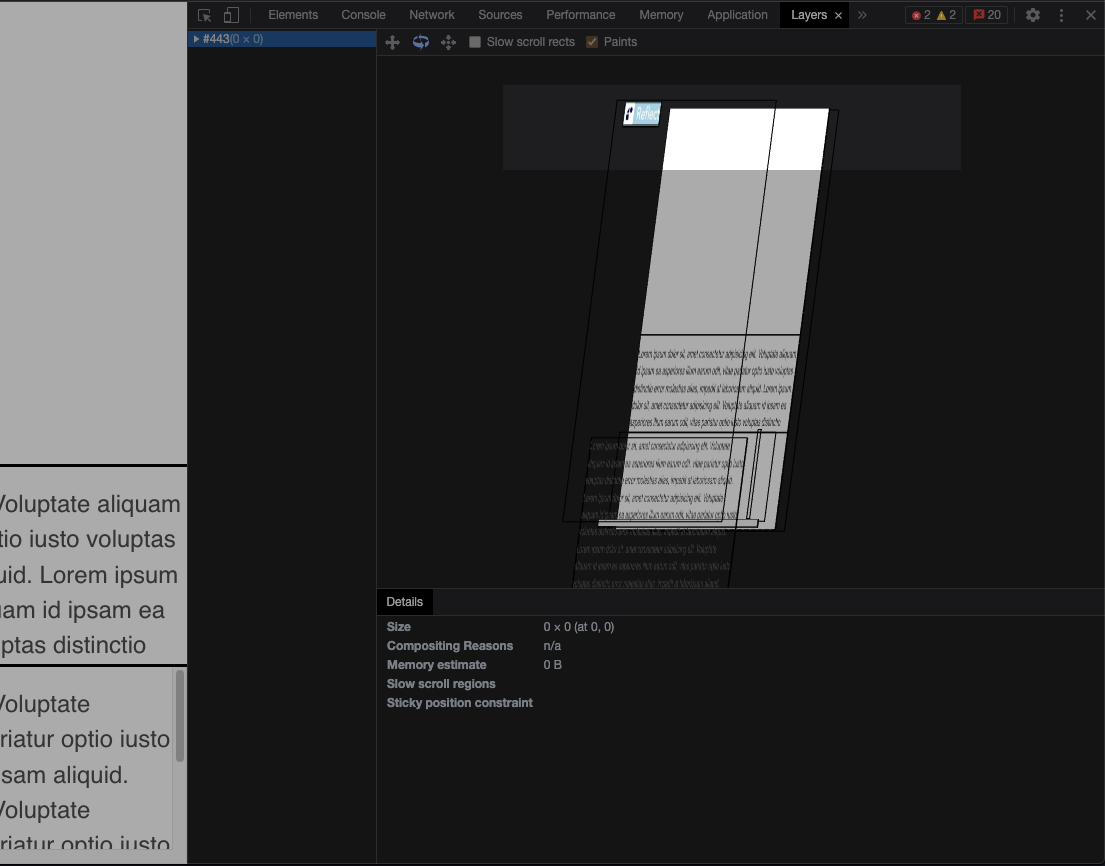
Based on what we observe on the page, there’s no reason why the image should not be on its own layer. If it were lifted above the rest of the document then any changes to its dimensions will, by definition, have no layout impact on the rest of the document. The image and the document should be modeled as completely distinct entities allowing one to change without impacting the other.
But hold on. The browser is reporting that there’s a constant layout shift occurring, but we’re not certain what specifically is shifting. The text on the page doesn’t appear to move, so it’s possible something else. Let’s try and identify where this layout shift is happening.
Step 10: Press cmd+shift+p to bring up the Command Menu and start typing “layout shift”. Press enter when “Show layout shift regions” is highlighted
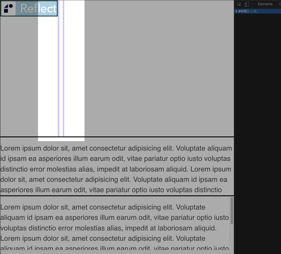
We found it! There’s a region next to the image that is constantly having its layout shifted. If you take a look at the DOM in the Elements panel
you’ll find a single div with nothing but a blank space in it.
|
|
Problem solved! You could just remove that div and the layout shifts will go away. There are two problems with this approach.
- It does not solve for the issue originally discovered in the Layers panel.
- That’s the marketing team’s tracking
<div>. Yes, it’s used in a webapp in the middle of a document, and yes it’s a div for some reason, and no you can’t move it.
So our goal is still the same. We want to move the <img> onto its own layer so that the animation does not cause any layout shift. There are a few
ways to do this, but for the sake of this article we’ll use a specific positioning strategy we know will force the element onto its own layer.
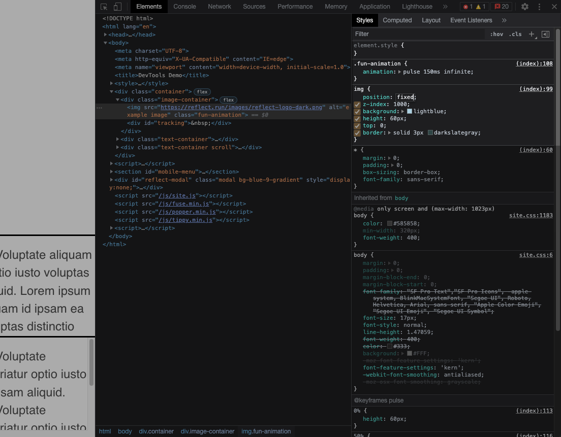
When an element uses fixed positioning, it is (generally) taken out of the normal flow of the document and positioned relative to the viewport itself. This forces the element onto its own layer, and thus hopefully solves the problem. Let’s try this out
Step 11: Inspect the <img> element again in the Elements panel. You can use the technique described in Step 4, or use the “inspect element” button in the top left of devtools, then switch to the “Styles” tab.
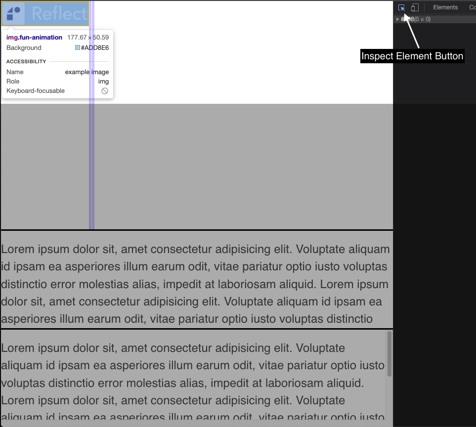
Step 12: Replace the position: relative style with position: fixed
Step 13: Now navigate to the Layers panel and expand the first item in the sidebar. Observe there is now an img layer. You can further confirm this layer is distinct by rotating the model and observing a separate layer for the image
Step 14: Navigate back to the performance tab, record for 2-3 seconds, shift+click the image, wait for 2-3 more seconds, then stop recording
🎉 Congratulations! 🎉 The change you made to the positioning strategy forced the element onto its own layer, which in turn meant that it has no layout impact on the rest of the document. You can observe that the latest performance recording shows no more layout shifts happening!
Conclusion
Using only devtools we were able to identify the root cause and fix for a performance issue in a codebase with which we were not familiar. Keep these tips in mind the next time you’re trying to debug an application and keep in mind that devtools + the browser itself are extensions of a webapp development environment, like being part of an IDE.
Recap
cmd+alt+iopens devtoolsescwill toggle a drawer containing the Console and other tools across all panels$is shorthand fordocument.querySelector(assuming the page has not defined$itself)- You can right click elements in the console and reveal them in the Elements panel
$0is a global variable referring to the currently selected element in the Elements panel- You can set conditional breakpoints in the Sources panel by right clicking on a line
- The Layers panel gives you insights into how the renderer “sees” your application before compositing
cmd+shift+popens the Command Menu and can be used as a shortcut for most devtools actions
Caveat
The example used in this article is contrived for simplicity, and the performance issues would be better solved using other techniques like only allowing css transformations on styles that can be accelerated by the GPU. The goal is to show the reader devtools techniques with applications in the real world, not to espouse the actual code-writing skills needed to build a performant application.


